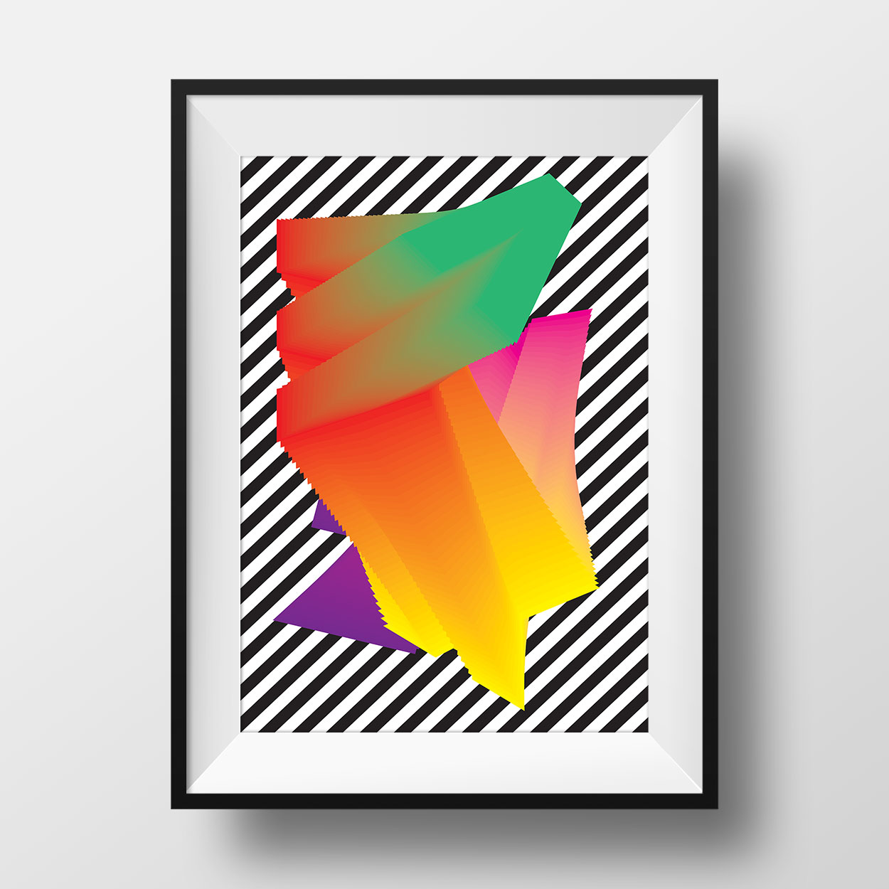
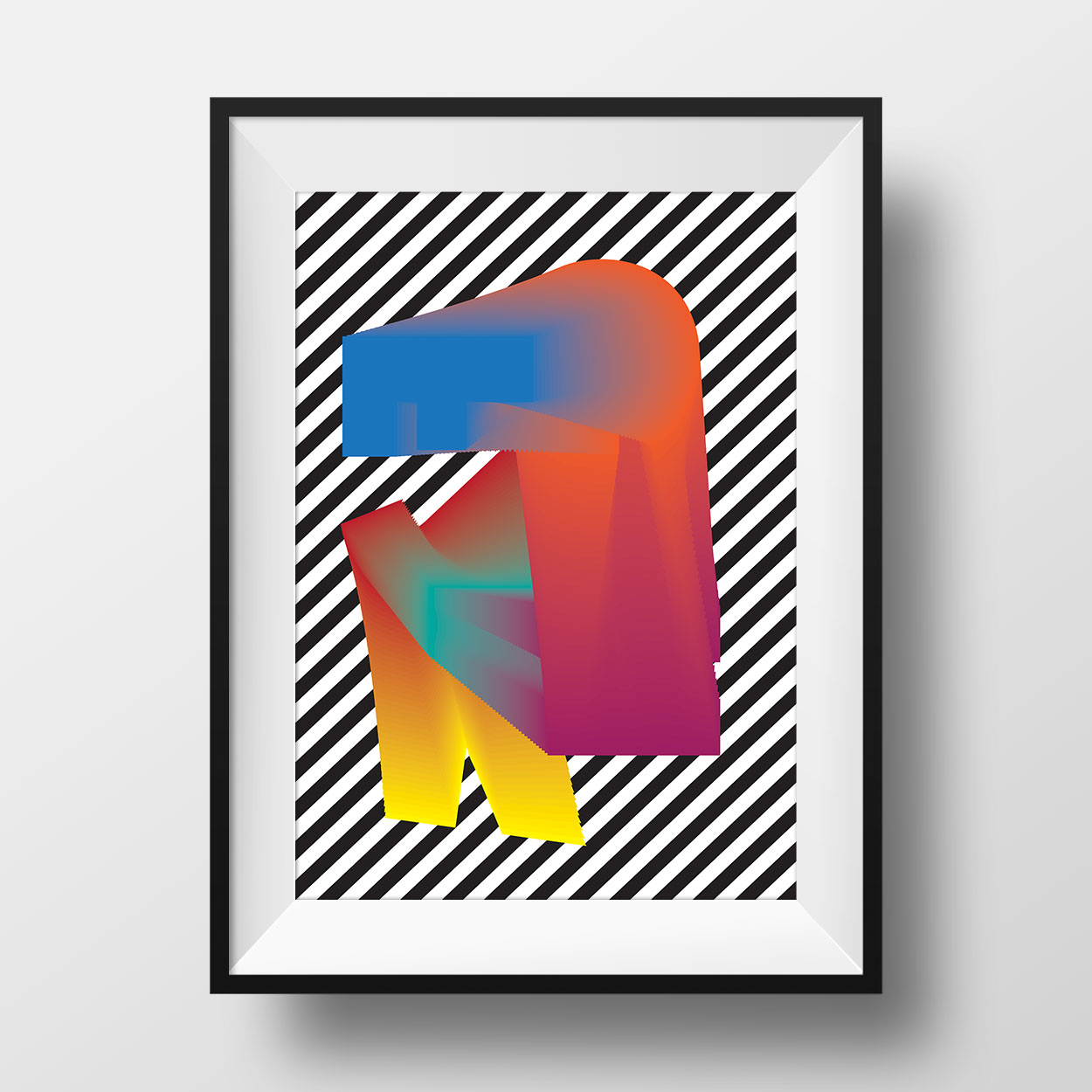
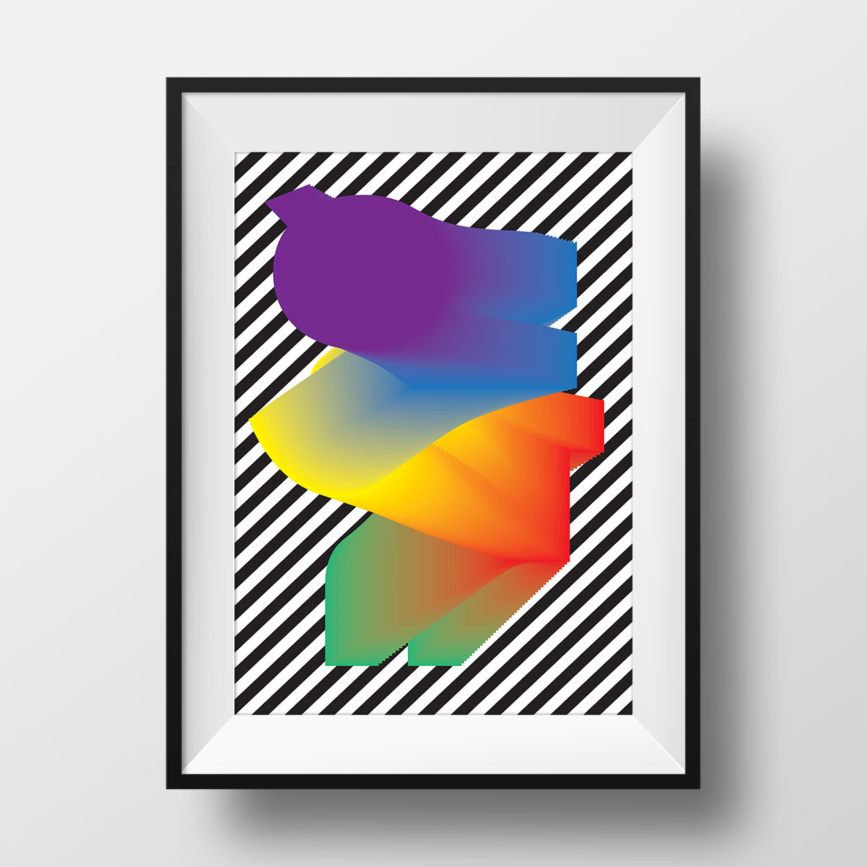
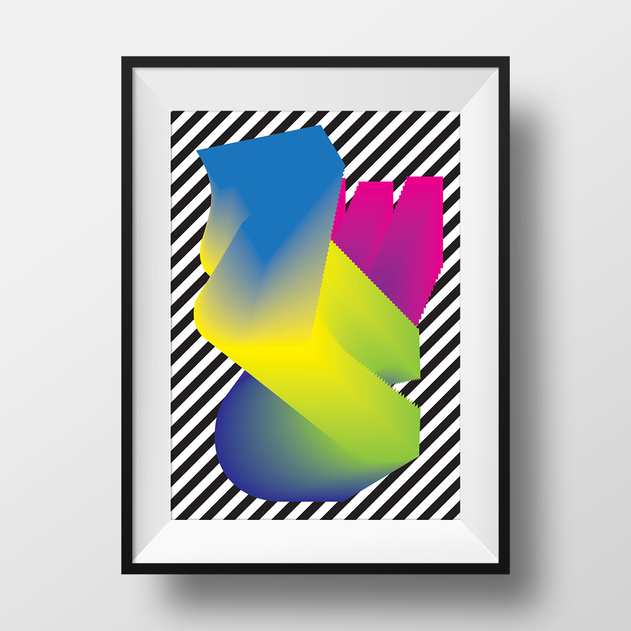
Flux Poster Series
Type + color + stripes = too much?
In this experimental poster series, I decided to combine typography and color in ways that I had no constraints. I wanted to learn from my own practice the point in which two graphic design ingredients largely used can become overwhelming for me. I was basically trying to answer myself the question: "how much is too much for you to take?"
Being trained in a more minimalist and structured way, seeing this body of work come out felt refreshing and eye-opening. I definitely feel that I took some risk I would not allow myself before. The result is a series of four posters in whic the forms are randomly composed and each one has a different color. The stripes bring visually constrast with the more chaotic object by being very ordered and by having a perfect rhythm.