School of Art and Art History Website
School of Art and Art History Website Redesign
"The School of Art and Art History provides a creative, multidisciplinary environment for students of the studio arts, the history of art, and art education. Established in 1936, the school is firmly grounded in the College of Liberal Arts and Sciences. It encourages interaction among its diverse faculty as well as collaboration with related disciplines across campus."
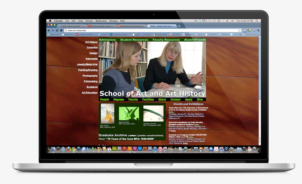
In this project, the main focus was to update its design. Dated from around the 2000s, the existing site had a series of small modifications to accommodate new necessities of the academic department but up to this point never had a complete overhaul of its architecture/design/interface.
With that in mind, the first major task was to reorganize the structure of the existing site, reordering its navigation system to a simpler way where the user has to choose major categories of information at first and then within each category a more specific option. The architecture of the pages was also adjusted for a more consistent user experience. As mentioned before, the various updates over the last decade caused some visual identity/consistency problems.
The project's design responsiveness was not in the scope of the project back in 2011. Therefore its redesign is focused on desktop/laptop devices.
Client Liaison: Eric Dean (main coordinator), John Beldon Scott, Ab Gratama, Laurel Farrin, Steve McGuire, Bob Glasgow, Pat Arkema
Information Architecture: Vinicius Lima
Interface Design: Vinicius Lima
Visual Design: Vinicius Lima
Functional Mockup Development (HTML, CSS, Javascript):Vinicius Lima
Website Navigation Structure
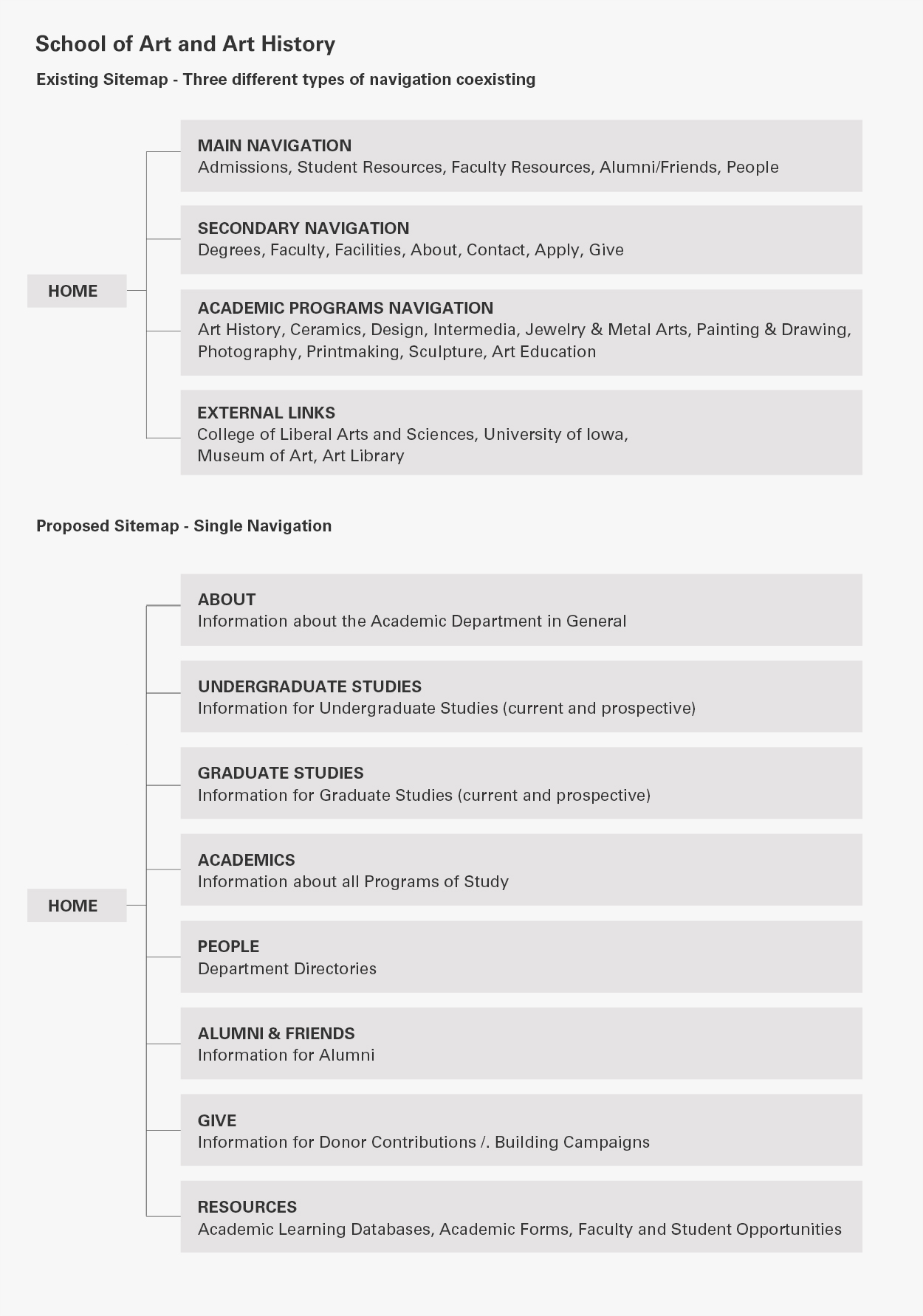
The former navigation structure of the site had a lot of different options for users to access the information, making it confusing to the point where sometimes the information was never found. There were around three main areas of navigation that served different purposes. The first listing resources for prospective and current students and faculty. The second listing information about the Department and the third about its programs. That totalled around 22 different first-click navigation options as soon as the user lands on the Deparment address.
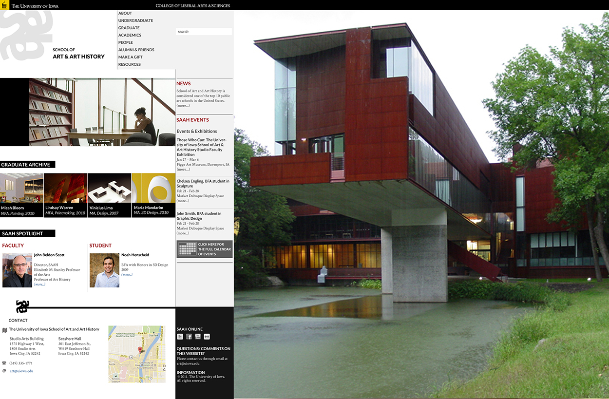
The new suggested structure proposes that the 22 navigation items be merged and recombined into 8 (About, Undergraduates, Graduates, Academics, People, Alumni, Make a Gift and Resources). It was a request of the department to have the Alumni and the Make a Gift options isolated as these could help potential donors get to the donating process faster. The Third navigation before now got condensed in the Academics item and Prospectives and Current Students can now choose to access their information based on its academic status (undergraduate or graduate). From these 8 major sections of the site, the user can then access second-level options that would then target him to the content.
Webpage Architecture
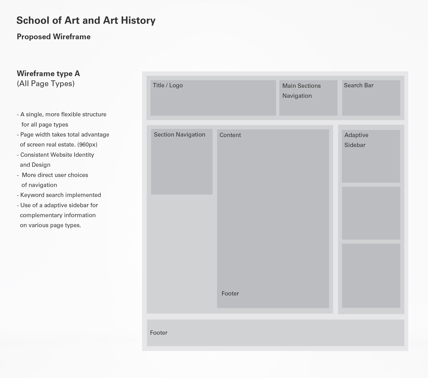
The existing site had various kinds of architecture added onto it as the small updates were made over the years, which brought to it a high level of visual inconsistency and inconsistency of user experience.
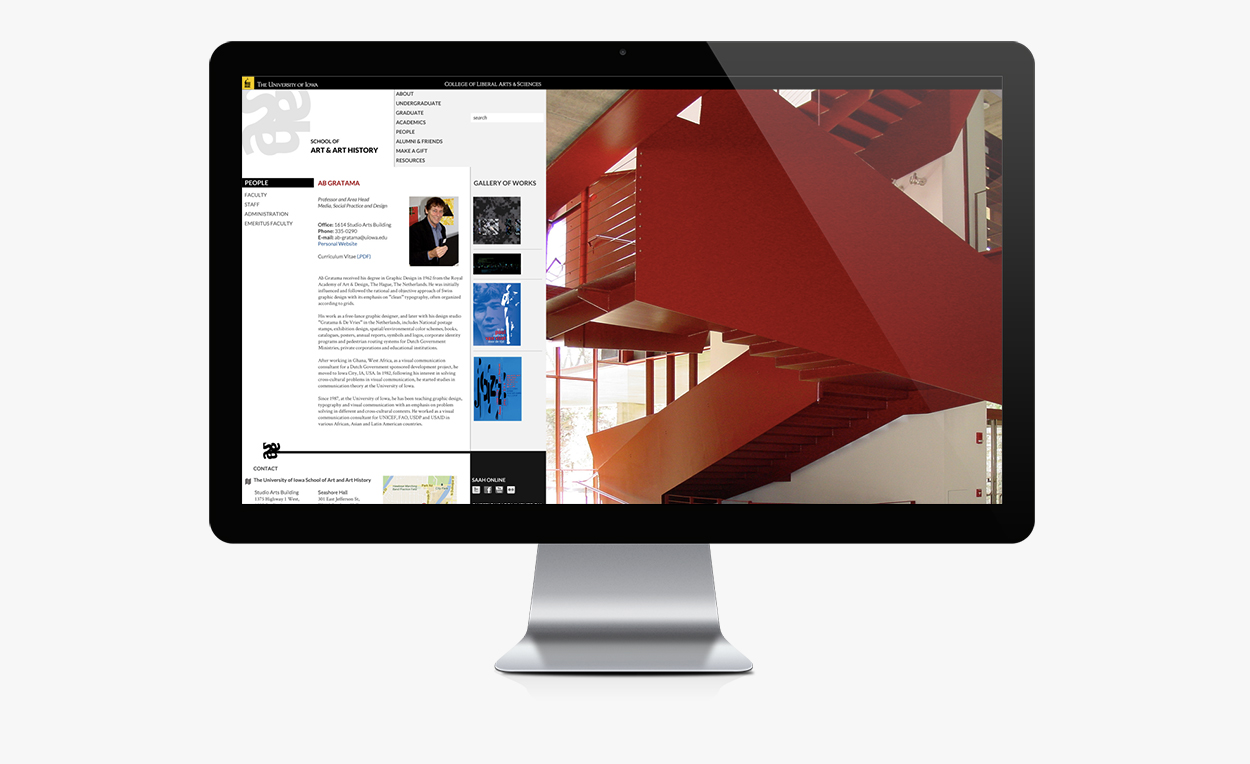
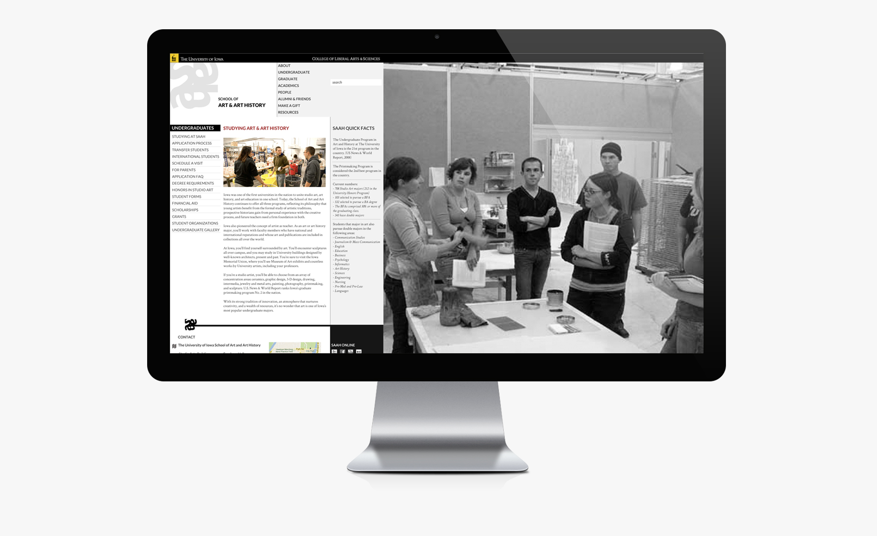
The new suggested architecture proposes a wireframe structure where the content area can adapt to different page types and where the use of an adaptive sidebar can serve as an item for complementary information in each different section of the site, while keeping its experience consistent.
Webpage Designs
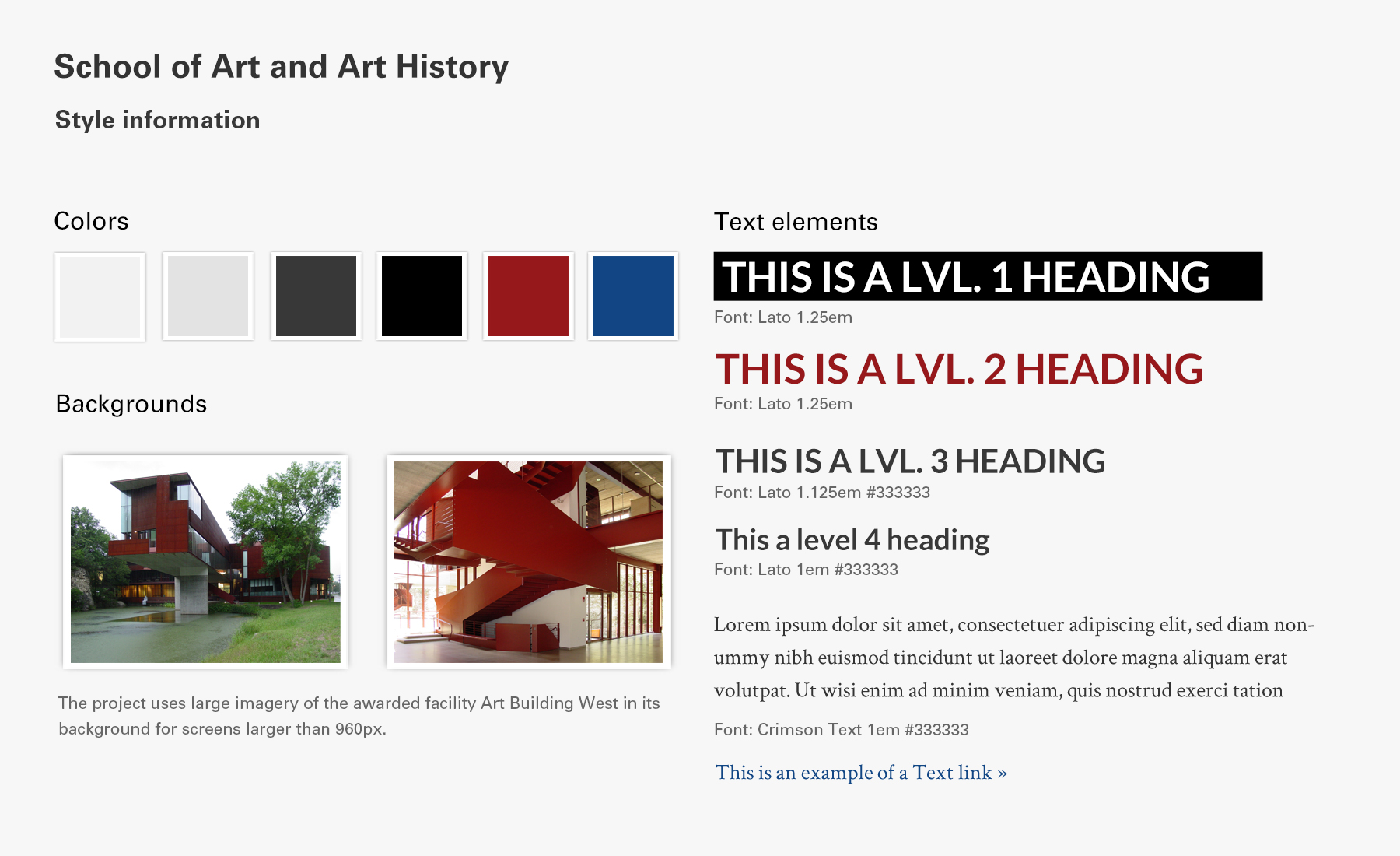
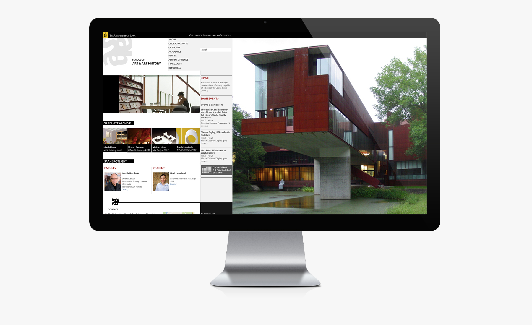
The major objective here was to guarantee the website could be visually attractive for studio art and art history majors. The whole project is based on grays and white for the backgrounds and red as an accent color. The typography mixes sans serifs and serif typefaces for a more sophisticated composition. In the background, large imagery of academic settings and facilities engages larger screens and complements the minimalist approach of the whole project.
The various rectangular shapes on the pages are actually reminiscent of one of the Department Facilities - Art Building West - designed by Steven Holl. HIghly awarded, the structute became the main construction of the School and it was then requested that the website had a visual dialogue with it.
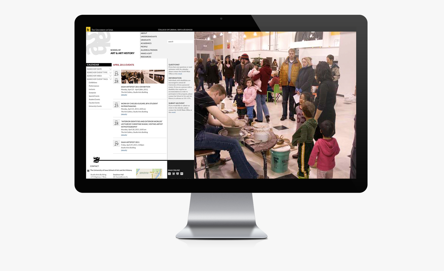
Event Calendar Page
One of the major design transformations in the project comes in the event information. As a lively department, many events happen at the same time and should be displayed with all information so users can refer to it. The new calendar section suggests a weekly list on the home page and a full monthly event list as the user clicks for the full calendar of events.
In the full calendar section, the user has the option to filter the search by date, by event type, by academic program or by type of event. He also has access to full details of each event, including potential posters, photographs and press releases. All events can be shared to major social network sites.
